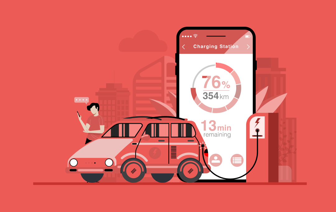
The two trendsetters of mobile domain – Android and iOS are also the two biggest rivals when it comes to mobile app design.
The build-up curiosity regarding Android vs iOS in terms of market share, popularity, demographics, among others have also reached the mobile app design front.
So, here we are with our plate full of simple design differences between Android and iOS. Through this infographic, we assess and analyze the minutest differences in the applications designed for either platform. This will help us in figuring out how one is different than the other.
*Due to fragmentation, there are slight differences in the app designs for Android.

Let’s start with understanding the Android vs iOS UI app design comparison in respect to Flat Design and Material Design.
Flat/Human Interface Design vs Material Design
Human Interface Guidelines are primarily based on three tenets: Clarity, Deference, and Depth. In simple words, the approach supports minimalism, uses crisp elements, and focuses on typography and flat colors.
In brief, Android Material Design is believed to be an upgraded version of Flat design with a hint of skeuomorphism.
In the words of Matías Duarte, Google’s Vice President of Design it is –

Android Material design components can be treated as an enhanced version of flat design with a touch of skeuomorphism (a popular design concept of making items represented resemble their real-world counterparts).
With these basics out of the way, let’s delve deeper into the differences between the two platforms’ – Android vs iOS app designs since UI/UX design in an app is nothing less of being extremely crucial.
iOS vs Android: Navigation
Top-of-screen navigation
Speaking of design rules for Android, applications generally display the title in the top-left corner after either a drawer menu or a back button (which is optional). Moving more to the top-right, there is always an action item like a search icon (can be more than one also such as favorites icon), followed by the overflow menu.
In the case of iOS apps, the name of the previous tab is always mentioned in the top-left corner right next to the back button option. In the middle, the name of the current tab is mentioned while in the extreme right corner the option of “Edit” or “Done” (Control button), in some cases, is given.
Primary navigation
In iOS applications, the primary in-app navigation patterns always follow the foreground and the hamburger menu used specifically to store once-in-a-while used functions. Whereas, on comparing Android vs iOS UI design, you would usually see primary navigation in the hamburger menu or spread throughout the interface in the form of the search bar, floating action buttons, among others in the former.
Secondary navigation
A navigation drawer is a menu that opens from the left to right once the hamburger menu icon is pressed. All the tabs are placed right below the screen title, allowing the user to switch between views, data sets, and functional aspects of an app.
Apple Human Interface Guidelines state that there is no standard navigation control similar to the drawer navigation menu. Instead, you will find global navigation in a tab bar in all iOS applications, which is placed at the bottom of the app screen, providing the capability to quickly shift among the main sections of an app. You will find the secondary navigations under the “More” tab.
Back navigation
There are four ways to employ the “back” action in iOS apps –
- Left-to-right swiping gesture in applications to go to the previous screen.
- Simply pressing “back” like action.
- Pressing the “Done” option for non-editing modal views
- Swiping down on the screen for modal and fullscreen views
In some cases, the back-like action is given in the Android application through which you will land on the previous tab. However, the most common and easiest way is to use the Material design back button in the navigation bar (which is now optional in Android 10).
{Note: Also read “A Comprehensive Guide on Typography in App UI Design”}
iOS vs Android: Buttons
The most basic design difference between the button styles in iOS and Android applications is that the buttons in iOS apps follow the flat design pattern, so consequently, support title case. However, Android application follows Material Design so inherently they possess uppercase with buttons styled with shadow.
Another rather trendy button is the Floating action button (working as a call to action button) employed by both Android and iOS. For example, the compose button in Gmail in Android, and button for new posts on social media apps in iOS.

iOS vs Android: App icons and Screen resolution
Both the systems use an 8dp grid to build the screen structure, while the most common margins are 16dp.
This table shows the supposed size of the icons designed for iOS apps with different screen resolutions.

It is understandable that these tables may seem a little overwhelming at first, however, if you know the base size and are able to check and export at numerous larger multiples, all of it becomes simpler.
iOS vs Android: Typography
For years, Apple was a fan of Helvetica Neue font, however in 2015, it made a dynamic change to San Francisco, which is more space-efficient and is perfect for mobile phones, desktops, and iOS Watch.
Android, for long, has been using Roboto as the standard system typeface. And there are no plans from Google to change this beloved element for the foreseeable future.
iOS vs Android: Control Design
Search

Search functionality is very important for both the platforms, something that is evident from the recent inclusion of “Search bar” in iMessage by Apple.
In Apple, there are two types of search options – prominent and hidden. Usually, the search icon is displayed on the upper tab while sometimes you need to drag the screen from top to bottom to reveal the search bar. Moreover, to cancel the search query, you can press ‘Cancel’ and for clearing it, use “X”.
In Android, there are no hidden search bars and you can always find one in the upper tab. To cancel the search, you can simply click on the “←” icon and to clear the query, it is the same as it is in iOS.
Primary call-to-action
FAB, the floating action button poses as a primary call-to-action button in Android and can appear on top app bars or the edge of some components. Whereas, the primary call-to-action button in iOS apps always appears on the upper-right corner of the page.
However, witnessing some exceptions, a few iOS applications might show CTA at the bottom toolbar, and Android apps in the upper toolbar.
Selection controls
If you need to show a few options, you can use a picker control on the iOS platform. Pickers can appear anchored at the bottom (as shown in the Android vs ios app design infographic).
For showing few options on the Android platform, usually, a dropdown menu, appearing in-place, or a modal dialog, that appears centered and darkens the app background, is used for listing the options.
Tabs
What has been observed is that iOS does not have a control visually resembling “tabs”. Instead, it asks you to use a segmented button. On the contrary, Android uses a more “flat design” approach for the same display as you can see in the Android vs ios app design infographic.
iOS and Android: Cards
Cards are a collection of images, text, movies, and also includes buttons and comments.
In iOS, the cards have – no shadow, full-width, and no round corners. Whereas, in Android, the cards are designed with features such as shadows, gutter, and round corners.
iOS and Android: Alerts
Android alerts employ the flat button styles, something for which the dimensions can be found in the material design guidelines. The action buttons are placed at the bottom right of the alert. The “buttons” are entirely text-based (all caps), making it easier for users to understand.
As for iOS alerts, the actions are separated by dividers. They are basically in sentence or title case, gaining their structure from the separate blocks. They are placed in the center and at the end of the popup.
This Android vs iOS app design infographic has covered all the preliminary differences to get you started in mobile app designing. There were all the differences we came across between the iOS vs Android App UI Design, something that will help you while designing a mobile application for iOS or Android. There are always iterations made to the guidelines so, make sure to keep yourself updated in order to design an app with the higher chances of getting selected on these platforms.
Frequently Asked Question
Q. Why do apps look different on iOS and Android?
The difference between brands and their ideology has rippled down to how their operating systems operate. The UI design of both platforms has become symbolistic of the brand.
Q. How to design a native app?
While designing a native app, one must always adhere to the iOS UI app design guidelines and Material design guidelines. This will render an application in sync with the platform it is meant to target. Plus, these platforms have a different requirement, so your app must fulfill them in order to get published on the app stores.
Q. Is iOS more user-friendly than Android?
The answer to this question is purely subjective. It is based on the personal preference of the users. Some may find iOS more practical while some preach Android in all respects.
 Contact Us